Faux Cartooning in Photoshop
December 30, 2009
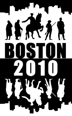
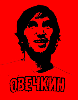
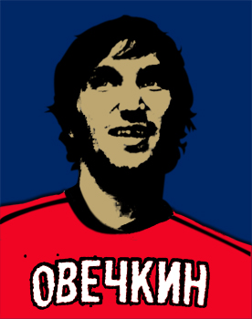
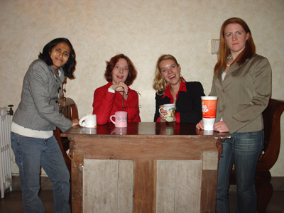
So I stumbled across a method in photoshop recently that in a few quick steps can make just about any image (provided it has enough detail and contrast) appear to be hand drawn. There are built-in filters that can approximate this effect, but I found this method produces better results and can be fine tuned a bit more. All you need to do is apply a Gaussian blur with a radius of at least 3 pixels (and up to 10 or so, I had good results at 4.5 on many historical images) to the image layer, then fade the filter effect (shift+ctrl+f) using the Darken or Darken Colors mode to dial back the blur. You can play with pixel radius of the blur and the opacity of the fade effect, as the best results seems to vary from picture to picture. I had great fun messing around with this on historical color images from Wikimedia Commons. Here’s couple examples of the historical variety, and one of my more successful modern ones.


0 comments on this post.